TRANSCRIPT
Haley Oeur 0:06
Hi everyone! My name is Haley and I am the Online Managing Editor of The Purple Tide, Chantilly High School’s school newsmagazine, and today we are going to be doing a podcast. This is episode four of Chantilly Contests, and we are going to be ranking in the class murals. So today I have two guests with me, if you would like to introduce yourselves.
Gretchen Mull 0:25
My name is Ms. Mull. I’m one of the art teachers here at Chantilly.
Paparda Tanadumrongsakd 0:28
Hi, I’m Paparda, and I am not qualified to be here.
Haley Oeur 0:32
Paparda is very qualified to be here. I’ve seen her art, she’s very capable. I’ve created a very convenient slideshow for this, so we’re just gonna go through the murals that I’ve seen all around the school, and basically rank them, how much we liked them, is it representative of the year it was made, all these things. I, myself, I don’t think I’m super qualified to do this, but I have been at the school for four years, which…
Gretchen Mull 0:55
-is longer than I’ve been at Chantilly.
Haley Oeur 0:57
Oh, look at that! See? So I’m basically more qualified than an art teacher, is what I’m hearing.
Gretchen Mull 1:01
Perfect.
Haley Oeur 1:03
But yeah, that’s the plan. I will be putting the pictures up on the actual website when this gets posted. So that there’s reference for the listeners. So the first one is this one 1992. This is outside the cafeteria. I think this one’s really funny because he has a really muscley thigh.
Paparda Tanadumrongsakd 1:21
He has a very muscley thigh.
Haley Oeur 1:23
He does.
Gretchen Mull 1:24
I think the actual artwork of the mural is, like, very well done. There’s lots of shading, highlights, shadows, you know, from the art teacher. However, I don’t really know that I see the voice of that class. That could be any class.
Haley Oeur 1:39
It’s really weird, because you’re going to see this when I show the next slides, but it goes from 1992 to, like, 2000 immediately, like I don’t know where all the murals in between that went. I guess they like this one a lot. Yeah, I don’t know.
Gretchen Mull 1:50
I don’t know if this is like a secret.
Haley Oeur 1:52
Oh?
Gretchen Mull 1:52
But I think they like there’s only so much space in the school. So I think some of them actually get covered up.
Haley Oeur 2:01
Oh, interesting.
Paparda Tanadumrongsakd 2:03
The one on the side of the staircase.
Gretchen Mull 2:04
Well, that’s my guess as to why some of them are missing, because Chantilly’s been here for 50 years.
Haley Oeur 2:10
That’s true.
Gretchen Mull 2:10
So if we have one mural every year, that is a lot of murals, and we only have so many walls.
Haley Oeur 2:15
So why did they keep this one then?
Paparda Tanadumrongsakd 2:17
It’s very patriotic. It’s very Chantilly.
Gretchen Mull 2:20
Obviously, the muscley thigh.
Haley Oeur 2:22
Of course, of course. Onto the next one. This one is in the cafeteria. Conveniently, I accidentally took a photo where the table’s blocking the year, but I think it’s before the year 2005. I think it’s okay. It’s a knight, we’re going to see a lot of those. I think that’s a common motif of many of the murals.
Gretchen Mull 2:39
And I wonder why.
Haley Oeur 2:40
I wonder why. But yeah!
Gretchen Mull 2:43
I think some of the, like, perspective leaves a bit to be desired. Like, there’s some weirdness with the neck and the head. I feel like maybe it’s a little bit more dynamic than the last one.
Haley Oeur 2:56
I agree.
Paparda Tanadumrongsakd 2:57
I feel like the colors are getting more Maryland flag, a little bit, than Chantilly. It looks more navy, and also the yellow and the black.
Haley Oeur 2:57
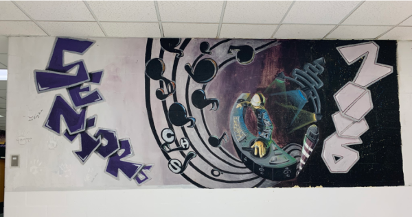
Okay. 2006, the year I was born. 2006 pictures a man who’s DJ-ing and there’s a staff coming out of his DJ set with the word “seniors.”
Gretchen Mull 3:10
Wow. Yeah, I think this is fantastic.
Haley Oeur 3:14
Me too. I think this one is so cool. I think the “seniors” is cool.
Gretchen Mull 3:18
Yeah.
Haley Oeur 3:18
I think the DJ is cool. It’s kind of Daft Punk-y. And I think that’s very fancy.
Paparda Tanadumrongsakd 3:24
I really liked the way it looks, what is it called, fisheye?
Gretchen Mull 3:28
Yeah, yeah.
Haley Oeur 3:30
Yeah, I do think that perspective is very fun.
Paparda Tanadumrongsakd 3:32
That’s really hard to do, in my opinion. And they did it, like, really well.
Gretchen Mull 3:36
It also looks like a combination of people’s artistic viewpoints were put together in one mural, like, it doesn’t seem like one artist or one person’s perspective. There’s a lot of things going on, which all go together. And they’re done in a similar style, but it feels more encompassing of whole classes’ personality than just a charger on a wall.
Paparda Tanadumrongsakd 4:00
I agree with that.
Haley Oeur 4:01
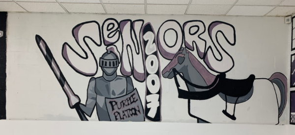
I think from here on we have a mural for every single year up until kind of now. So 2007. So 2007 bubbly lettered and there’s a horse who is kind of unfinished, coloring-wise, along with a knight whose shield says “Purple Platoon.” This one, I think the idea is there. I think it’s definitely not as dynamic or as full as the other ones I would say. I feel like it’s got the basics.
Gretchen Mull 4:17
It feels incomplete.
Haley Oeur 4:19
It does feel incomplete.
Paparda Tanadumrongsakd 4:20
I was going to say that it looks a little unfinished.
Gretchen Mull 4:23
Like, to me this looks like the first layer of paint to block in all of your things. And then, like, where’s the rest of it?
Speaker 1 4:31
Yeah, I feel like it could use, I don’t know about, something in the back or maybe just, I don’t know, maybe more color. This one looks like it was from 2007, like it’s been here for almost 20 years. The 2006 one doesn’t look old, though.
Speaker 2 4:45
Yeah, it’s kind of hard to contrast the last one we looked at with this one because the compositions are like very, very different in this one. Not in a good way.
Haley Oeur 4:56
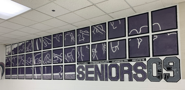
2000… Oh, I guess we don’t have 2008. Maybe the other one from the cafeteria was 2008. This is 2009. 2009 has a grid-like shape with the silhouette of a crowd in the background.
Paparda Tanadumrongsakd 5:02
It looks like windows to me. But, like, I think that effect looks cool, but it’s not really 2009-y, it doesn’t really show spirit as much as the other ones.
Gretchen Mull 5:13
So are you all not seeing that it’s like a crowd in the bleachers?
Paparda Tanadumrongsakd 5:18
Yes, but it’s not like, yay. It’s more like, they’re so disconnected looking. Yeah.
Gretchen Mull 5:26
So this one along with the first couple that we saw, basically all of them besides 2006, it’s like Chantilly spirit, but they’re not incorporating something that’s class or year specific. And I feel like if you’re going to make a class mural, there should be some personality element to it that is beyond just like, “Go, Chantilly! We graduated!”
Haley Oeur 5:49
I agree. They were trying to get in and out. Or maybe they were just like the party grade.
Gretchen Mull 5:54
Yeah. I mean, I like the layout. It’s very different than all the rest. But I feel like there could have been ways to add little moments to make it more specific to 2009.
Haley Oeur 6:03
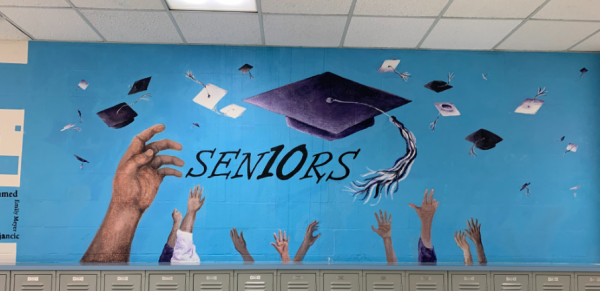
I think so too. Okay, this is 2010. 2010 has a bunch of hands in the air that are throwing graduation caps in colors of purple, white and black. This is my personal opinion: I’ve never been the biggest fan. I don’t know why. I think maybe it’s the blue. I don’t know.
Gretchen Mull 6:15
Oh, that it’s not, we’re not a blue school?
Haley Oeur 6:18
I don’t know. I feel like the blue doesn’t go well with the graduation hats.
Paparda Tanadumrongsakd 6:23
It’s not giving.
Gretchen Mull 6:26
Yeah, I think the rest of it is like a bit minimal, which is great. I think, you know, the graduation caps, it’s kind of a nice composition, but the blue feels just like a void. Like it’s not telling us anything.
Paparda Tanadumrongsakd 6:37
They did a really nice job on the hands, though.
Haley Oeur 6:39
Yeah, I agree.
Paparda Tanadumrongsakd 6:41
Good shading right there.
Gretchen Mull 6:42
Yeah, I agree.
Haley Oeur 6:44
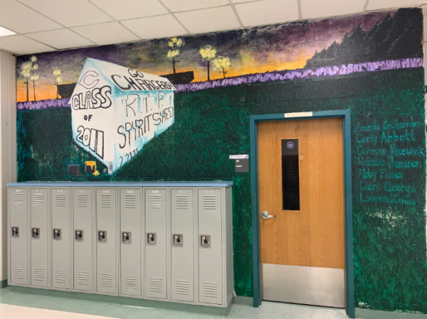
2011: RIP Spirit Shed. 2011 has a very dark color palette and in the middle, but has a white building that says “RIP Spirit Shed” on it with the field in the background. I always came across this one passing by. It’s by the Academy. And it was always a little confusing. I think it looks a little apocalyptic at first glance.
Gretchen Mull 6:58
Yeah.
Haley Oeur 6:59
Color scheme wise. I don’t know if that’s what they were aiming for, though.
Gretchen Mull 7:03
So is this when the Spirit Shed ended?
Speaker 1 7:06
I guess so? I’m not… to be honest, I don’t know what the Spirit Shed is.
Gretchen Mull 7:09
So when I first started working here, I was told about it. But I was under the impression that it was like, it lasted longer than 2011. But apparently not because this says RIP Spirit Shed. So my understanding is that, and I feel like all the faculty who have been here much longer, they’re going to tell me that I’m wrong. But there used to be a shed over closer in the parking lot. And the whole side would get muraled all the time. And it was like a big part of the Chantilly spirit culture, to have different groups in the school decorate the shed, just to like, celebrate things or to show off artistic skill. And then they either got rid of it or repurposed the shed. So it’s not there anymore.
I think this one has more of the character, I guess, of 2011, then. Yeah,
Haley Oeur 7:19
Yeah, and you have the stadium in the background.
Gretchen Mull 8:00
I like that they have a nod to the Spirit Shed, which it seems like was a really big part of like Chantilly culture, not currently, but when it was a thing. I do kind of wish that it was a little less apocalyptic-y, as you said. And also the whole background like around the doorway and where the shed is, kind of is just, there’s not a lot going on. I feel like they could have either zoomed in or added some more elements just to kind of beef up their idea.
Paparda Tanadumrongsakd 8:31
Looks like the whole world is burning.
Gretchen Mull 8:34
Yeah.
Haley Oeur 8:35
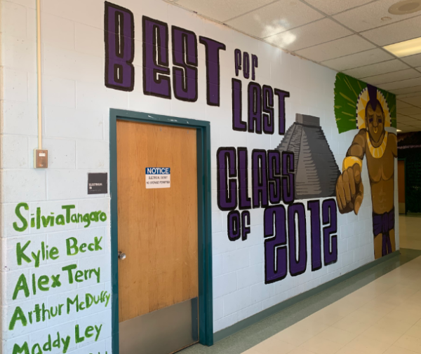
- 2012 says “Best for Last Class of 2012” with a Mayan structure in the back with a Mayan man pointing. I think this one is pretty cool. Although, I am confused about who the guy is.
Paparda Tanadumrongsakd 8:40
Is that a temple?
Haley Oeur 8:42
Yeah, so that, I did think that looked like some kind of like South American…
Gretchen Mull 8:46
So, wasn’t there a thing where there was like, some date in 2012 where everyone thought the world was gonna end?
Haley Oeur 8:55
Ohhh.
Gretchen Mull 8:55
Like according to…
Haley Oeur 8:57
I think you’re right. Like the Mayan-
Gretchen Mull 8:59
The Mayan Calendar. Yeah.
Haley Oeur 9:01
Oh.
Gretchen Mull 9:02
So to me, that’s what this is saying.
Haley Oeur 9:04
Oh, that is interesting. Okay, actually, that adds a lot of character.
Gretchen Mull 9:07
So I feel like this one is a little bit more tongue in cheek, I like this one a lot. It’s very well done. It’s kind of in your face, but I feel like that’s kind of the point of these class murals. So this one is set for me.
Haley Oeur 9:23
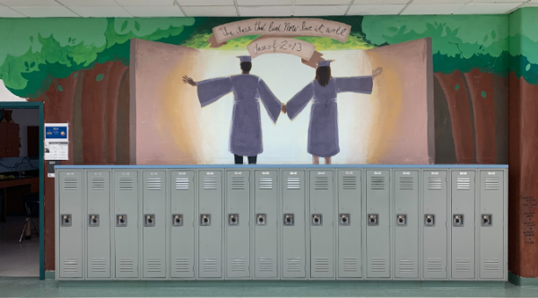
2013! 2013 has two people holding hands as they enter into a doorway that is full of light with trees around. So my thing about this one is that I feel like it almost looks like it has a religious undertone.
Gretchen Mull 9:30
Oh, no. Like they’re walking into the light.
Paparda Tanadumrongsakd 9:34
It’s giving Lana del Ray, “Let the Light In.”
Gretchen Mull 9:38
I feel like I have to like this one because I graduated in 2013, not from Chantilly.
Paparda Tanadumrongsakd 9:43
These people look like they knock on your door and be like, “Hey, would you like to join the church of this and this and this?”
Gretchen Mull 9:50
I feel like there’s connotations of…
Haley Oeur 9:52
Like we’re going out into the world?
Gretchen Mull 9:54
Oh, yes. But I feel like you’re right with either, like, religious or, like, walking into light. And sometimes people say that like when they’re crossing over from death into like heaven, if you believe in that, so and now I can’t unsee that.
Haley Oeur 10:09
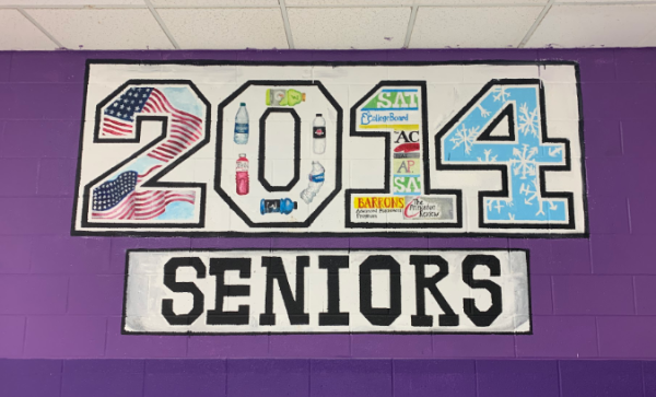
Oops. 2014. 2014 just says “2014 Seniors” but within each number of the 2014 there are symbols: the 2 has the American flag, the 0 has different water bottles, the 1 has different textbooks and practice books and 4 has a bunch of snowflakes. I personally think this one’s a little bit not as busy as the other ones, though, if you do look at it really close, I feel like there’s a lot of detail on the water bottles. These bottles, they have a lot of detail in them if you actually look at them, which I think is pretty cool.
Gretchen Mull 10:26
Definitely a little bit simpler of a composition, but they did pack a lot of detail. So I got to give it to them for that.
Haley Oeur 10:31
Do you think it snowed, like, 20 times that year or something like that, that they had a whole number?
Gretchen Mull 10:34
Yeah they must have had…okay. 2014.
Haley Oeur 10:37
Was that the year that we had, like, a week off school or something?
Paparda Tanadumrongsakd 10:40
There’s a lot of water bottles though. What’s that mean?
Gretchen Mull 10:42
Maybe there was some big recycling situation?
Haley Oeur 10:45
Maybe.
Paparda Tanadumrongsakd 10:46
Save the turtles.
Haley Oeur 10:46
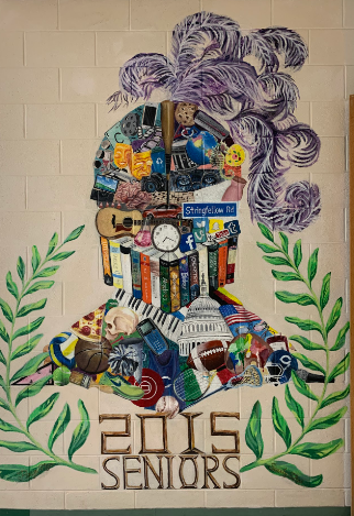
- 2015 is more vertical and says “2015 Seniors” with a laurel around it and a knight in the middle and this knight is a silhouette that is full of different aspects of the school and of the year, including the Stringfellow Sign, a guitar, the Capitol building and different textbooks. This one’s, this one’s very jam packed full of details.
Paparda Tanadumrongsakd 10:49
I love this one.
Haley Oeur 10:50
I do, too, I think this is very cool. Paparda, what do you love about it?
Paparda Tanadumrongsakd 10:56
I love, like, all the details. I love how they, like, managed to push everything in to make it, like, the charger but also, like, have character and not just be Chantilly spirit. And yeah, there’s just a lot of details that I can’t even see because my eyesight is so bad, like if I move closer to the screen, then you could see so much more.
Haley Oeur 11:15
I like the thought put in this one because I remember walking past it one time last year, and this is actually the math textbook that I used last year, which means that they’re actually using them, which is pretty cool.
Gretchen Mull 11:25
This one feels like it has a lot of thought and planning that went into it. It’s almost like a little mini time capsule of that year, but also like the years around it
Paparda Tanadumrongsakd 11:36
You can see the Vine app.
Gretchen Mull 11:38
Oh, I see the little Facebook icon there.
Paparda Tanadumrongsakd 11:42
That’s very reminiscent of the year, I think.
Gretchen Mull 11:45
I think this one’s great. 2015.
Haley Oeur 11:47
It is good.
Paparda Tanadumrongsakd 11:48
10 on 10. Yep.
Haley Oeur 11:49
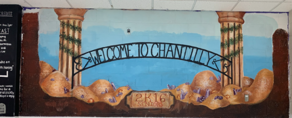
Okay, this was 2016. 2K16, if you will, as they wrote. It just says “Welcome to Chantilly,” I assume that’s the gate above the thing to the football field, but it has almost classical style columns, which is a choice. But then desert mountains below or something.
Gretchen Mull 12:09
I don’t get it.
Haley Oeur 12:10
I don’t quite get it.
Paparda Tanadumrongsakd 12:11
Those signs, they always remind me of zoo entrances, like the Smithsonian Zoo. And also, I don’t know what type those columns are. They look like Doric. I don’t know. Corinthian columns. It’s just random.
Gretchen Mull 12:23
Yeah, I mean, it seems very intentional. I just don’t understand why. Like the bottom part, I mean, and then the sky, I suppose. That also feels unfinished.
Haley Oeur 12:33
Maybe we’re missing some crazy niche inside joke.
Gretchen Mull 12:37
But yeah, I mean, it sounds like a very specific choice. I, just, it’s not connecting.
Paparda Tanadumrongsakd 12:42
There’s like piles of gold. Maybe the 24k Magic song released that year.
Haley Oeur 12:48
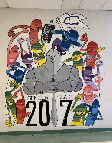
Okay, this is 2017. 2017 has a knight in the middle with the sword in the middle acting as the one, and is surrounded by colorful figures that are dancing around it. I think this one is pretty cool.
Gretchen Mull 12:51
Yeah.
Paparda Tanadumrongsakd 12:52
I like this reminds me a little of, like, corporate art.
Haley Oeur 12:55
Okay. I get that.
Paparda Tanadumrongsakd 12:56
But it’s really pretty.
Gretchen Mull 12:58
I feel like that’s a negative thing.
Paparda Tanadumrongsakd 12:59
No, that’s not a negative thing-
Haley Oeur 13:01
It looks like a professional graphic designer then?
Paparda Tanadumrongsakd 13:04
Yes.
Gretchen Mull 13:04
It has more of, like, an illustration, vibe to it. I like it.
Haley Oeur 13:09
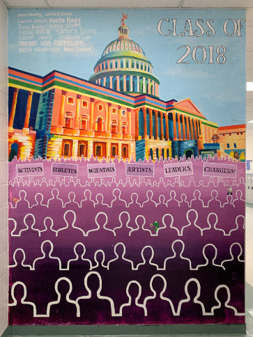
I like the people. 2018. 2018 pictures a very dynamically painted version of the Capitol, and the front has purple silhouettes of crowds with signs of different occupations. This one is cool. If you go up to it, it’s by the cafeteria door, and you look at it and they have tiny meme references on it. And it’s really cool. And I like that. Although to be honest, I don’t really see a big Chantilly representation. It’s more things happening that year to me for this one.
Gretchen Mull 13:28
Yeah, I agree.
Paparda Tanadumrongsakd 13:29
I see, like, Kermit drinking tea.
Gretchen Mull 13:31
As far as the quality of the mural, this one is fantastic. I think the group of artists really nailed the color, the perspective, the line work, I think is really stunning.
Paparda Tanadumrongsakd 13:43
I really love the color scheme for the building that they did for this one.
Haley Oeur 13:46
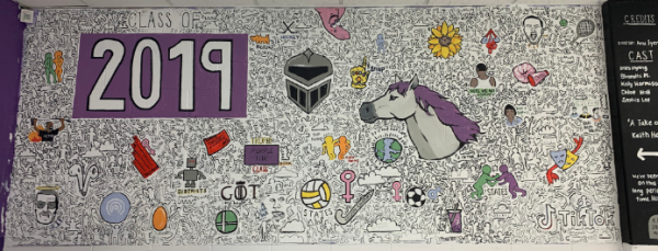
Yeah, I think that’s really cool. I don’t understand the color theory behind it. But I think it looks very cool to me. 2019! 2019 is in the style of the artist Keith Haring and has different elements of the year including Game of Thrones, TikTok, Airpods, along with Charger elements like a horse and knight.
Paparda Tanadumrongsakd 14:00
I like this one. There’s so much and, like, it looks very time intensive.
Haley Oeur 14:05
It does. It’s got the horse, but it’s also got all the elements of the year.
Paparda Tanadumrongsakd 14:09
You can see TikTok there in the corner.
Gretchen Mull 14:12
Yeah, I mean, it is very cohesive. It looks all encompassing, in a good way. And I do like it has the little Keith Haring reference.
Haley Oeur 14:26
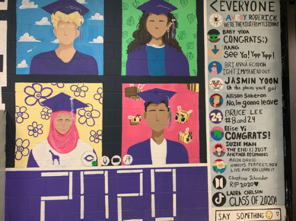
2020 features a Blackboard Collaborate background with each square containing a person with different colored backgrounds, and on the side, the chat bar has different names of the artists that drew it with little symbols including TikTok and BTS, and all these different things that represent how the year was online. This one is pretty cool. And I think this is possibly the most timely, and I don’t know, I guess very overly representative of the year, of the situation at the time, which is of course COVID. So they got this zoom background, kind of, or Blackboard Collaborate, if you will. And I think it’s really cool.
Yes, I think they did a really good job of reflecting on the moment that they were in, in this graduation year and making a really eye-catching mural with all those concepts.
Paparda Tanadumrongsakd 14:53
I love the bees, the Minecraft bees.
Haley Oeur 14:55
The Minecraft bees are very fun. Okay, also this isn’t in the photo but when we were taking these pictures I noticed something it has the, like, you know how on Blackboard Collaborate it has how many people are in the thing, it said like 667 or something like that. And I think that’s how many people are in the graduating class.
Paparda Tanadumrongsakd 15:09
That attention to detail.
Haley Oeur 15:10
And I was like, Yeah, that’s pretty cool.
Gretchen Mull 15:11
That sounds right. That’s about how big they usually are.
Haley Oeur 15:14
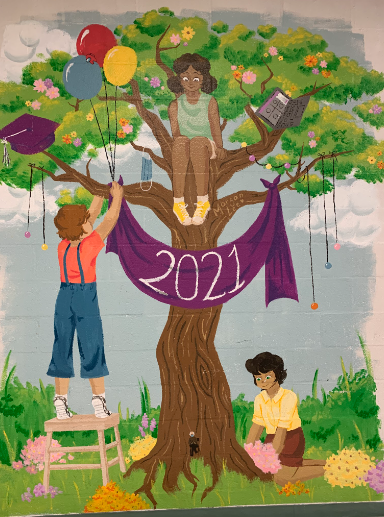
So I thought that was pretty cool, on top of all the details with the profile pics and stuff like that. Okay, this is 2021. 2021 has the year on a banner that is hung up from a tree. There are three people in the painting, one who’s sitting on the tree, one who’s hanging up the banner, and another who’s planting stuff. I think this is a good painting. I don’t know if this is very like senior-y or Chantilly representative.
Paparda Tanadumrongsakd 15:29
It just looks child, Children’s Day.
Gretchen Mull 15:32
It does feel a little bit more generic. I mean, it. The painting is very well done. It’s a beautiful painting, but it kind of feels like it could be in any high school in 2021.
Haley Oeur 15:44
I do think this is almost, not like in the art, because of the art, but because of the like the theme, it does feel very…
Paparda Tanadumrongsakd 15:51
It looks like it’d be like in a library and you’d, like, cozy up to a book next to it and you’d be like, “Oh, that’s a cute painting.”
Haley Oeur 15:57
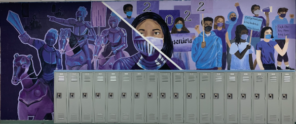
Yes, I think that’s pretty accurate. Okay, 2022. 2022 has a dichotomy, with the left side of it featuring purple knights and the other side of it picturing people protesting. There’s a girl in the middle, with one half of her face being a knight and the other half of her face being covered by a mask and her face. I like this one.
Paparda Tanadumrongsakd 16:01
I love this one too.
Gretchen Mull 16:02
I think it’s fantastic.
Paparda Tanadumrongsakd 16:04
I like how it like incorporated the Chantilly stuff, but also stuff of what was going on in 2022. Like all the protests and all that stuff.
Haley Oeur 16:12
I do think it’s very cool. And to me, just the juxtaposition of like the two things. It’s just very fancy.
Gretchen Mull 16:18
It does really mash the Chantilly-ness, like in the imagery and the color scheme and also with like, things that were happening that year, in a very nice, like, satisfying kind of way.
Haley Oeur 16:29
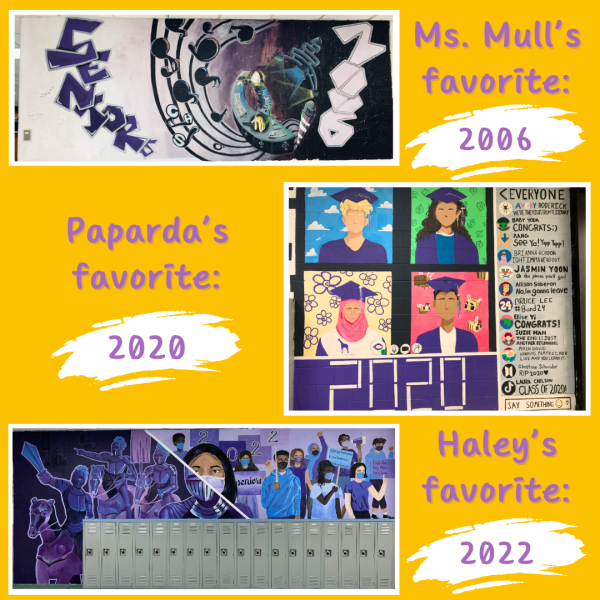
So that actually brings me to the end of my mural slideshow. But before we finish, I would like to ask each of you, which is your favorite mural or your favorite murals of what we’ve gone through here today?
Gretchen Mull 16:44
- No question.
Haley Oeur 16:46
What a banger.
Paparda Tanadumrongsakd 16:47
Was that the space one? Oh, yeah, I love that one too. That one and the Zoom one with, like, the Minecraft bees.
Gretchen Mull 16:53
Yes.
Haley Oeur 16:54
2020.
Paparda Tanadumrongsakd 16:55
Yeah. And I think maybe they put their names like instead of names of people on Blackboard, maybe it’s the names of like the people that painted it, which I think is really cool.
Haley Oeur 17:03
That is very cool. I think my favorites are, I do like 2006, and I also like 2022, which is the one-
Gretchen Mull 17:09
Oh, yeah.
Haley Oeur 17:10
…that’s kind of split. I think that one’s a good one, too. So yeah, that kind of concludes it. Oh, I did have one more question. Do you know if 2024 is going to be doing a mural, a class mural?
Gretchen Mull 17:20
I believe there is current discussions that are happening.
Haley Oeur 17:23
Okay. Exciting, exciting. I’m very, I’m very curious to see what will represent our grade. But yeah, that’s kind of what we’ve done today. We’ve gone through the murals. We’ve talked about our favorites. Do you guys have any other comments that you want to add about the murals?
Gretchen Mull 17:38
We’re working on a potential idea for National Art Honor Society, but we need to talk to Dr. Goodloe.
Haley Oeur 17:44
Mysterious, curious, but okay! Thank you guys so much for coming on. I really appreciate having you guys and your expertise on this podcast. This was very enjoyable and very fun. And yeah, that is the end of the podcast. Thank you, mysterious audience for listening, and we’ll see you next time!






Kathryn A • Jul 30, 2024 at 7:26 am
A little sad, that I think you missed my year 2005? Unless that was one of the one’s that was painted up. You’re all correct. Over the years CHS has painted over the murals instead of finding new spots. Disappointed that they’re aren’t better records of them. I thought there was a whole club for preserving them when I was there?
I was one of the few who worked on ’05 with my AP Art friends and came up with the idea for a woman knight. Not sure if we were the first, but we were the only one at that time.
Listening to this was fun! Love hearing your thoughts. Though there is a chunk missing from the beginning of the recording from before 92 to 2006.